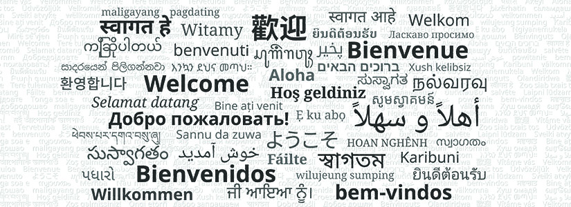
In the world of design, everything matters. Each color, space, shape, and angle presents an opportunity to tell a story about many things; from yourself to a company and your products, to your history, mission, and beyond… Even a seemingly basic decision like choosing the right typeface makes a world of difference in shaping your brand’s identity.
As one of the in-house graphic designers for Coeus Creative Group, I’ve learned to navigate the nuances of typeface and studied countless font families. Now, I can’t encounter an ad on TV without theorizing, “I think they’re using Avenir Bold…” So, I’m here to share some insights about the importance of typefaces in design.
Let’s get into some of the secrets of typeface usage and explore the subliminal branding messages they tell us.
Typeface VS Font
First, let’s get some vocab out of the way. Did you know “typeface” and “font” mean two different things? A typeface is the name of the overall design of letters and characters (“Arial”), while a font specifies their weight, width, or style (“Arial Black,” “Arial Narrow,” “Arial Italic”). You can think of a typeface as the umbrella under which slight variation occurs. All of the variations within a typeface are called a “font family.”
Legibility & Readability
When you’re choosing a typeface for a project, the first question is: is it legible? Meaning, can you make out what the words are? If yes, full steam ahead! If no, then it’s back to the drawing board. Be sure to take note of the elements you liked about this typeface; you may find similar characteristics in another, more legible one.
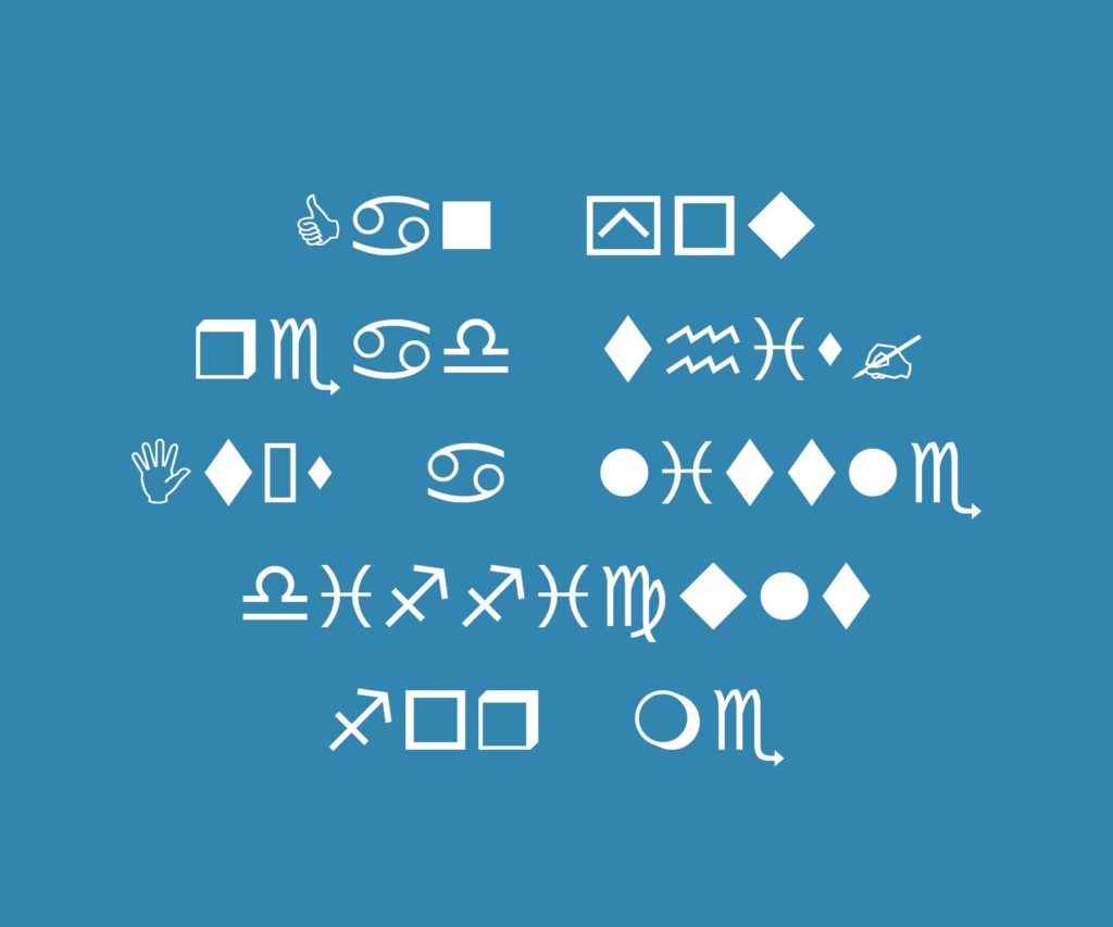
Wingdings is an extreme example of an illegible typeface.
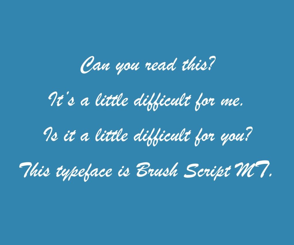
Brush Script MT is another typeface that can be tricky to read.
The second question to consider is: is the typeface readable? Now I know what you’re thinking: “Didn’t we already cover this?” But readability goes a step further then legibility. While legibility asks, “Can you read this?” readability asks, “Can you read this for an extended period of time without strain?” A typeface can be legible in the short-term but not readable in the long-term.
Readability is important for body paragraphs and larger swaths of text, but it’s not a major concern for titles and headings, which tend to be limited to one or two lines. If you’re really drawn to a font that is legible but not readable, then it’s best to limit its usage to titles and headings only.
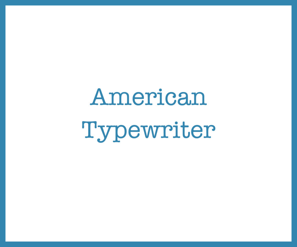
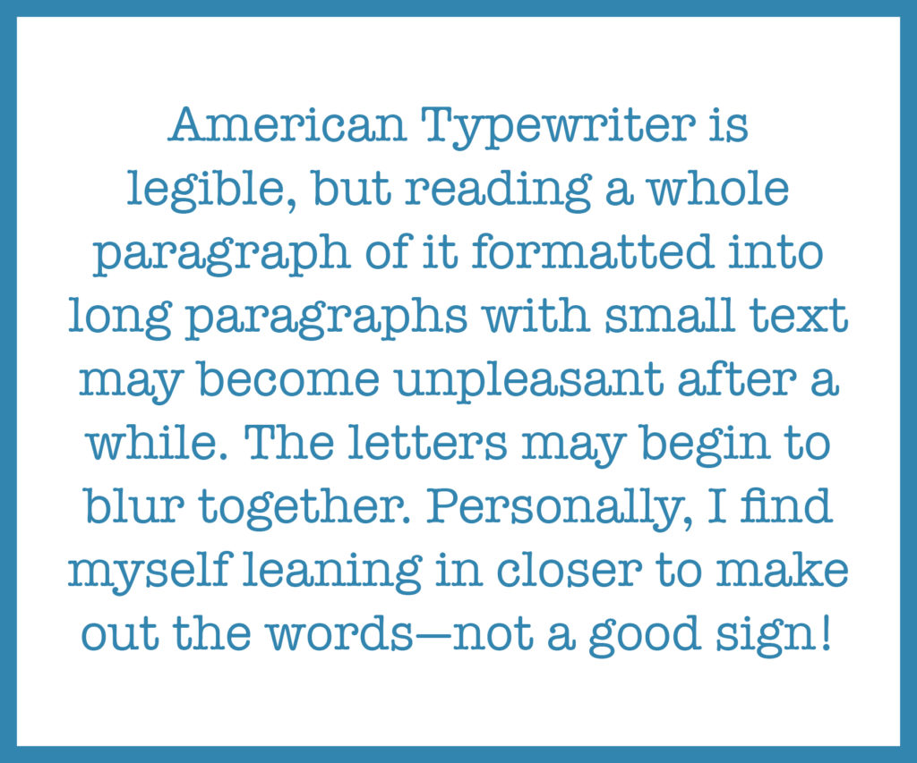
American typewriter is legible, but not the best in terms of readability.

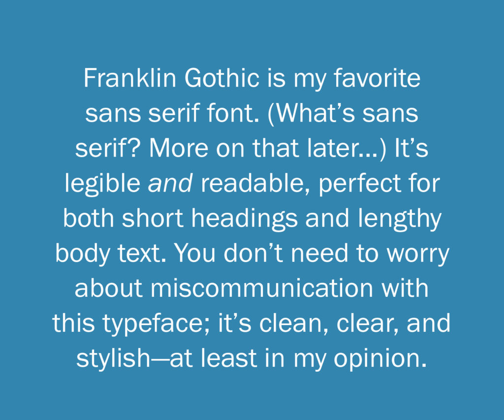
Franklin Gothic is both legible and readable!
In part two, we will start to look into serif and sans-serif, handwritten typefaces, and identity. In part three we will dive into how typefaces can make or break a brand.
If you’re interested in accessing part two and three they are included in our FREE digital White Paper. Click the link to get it now!

